Bounty Hunters
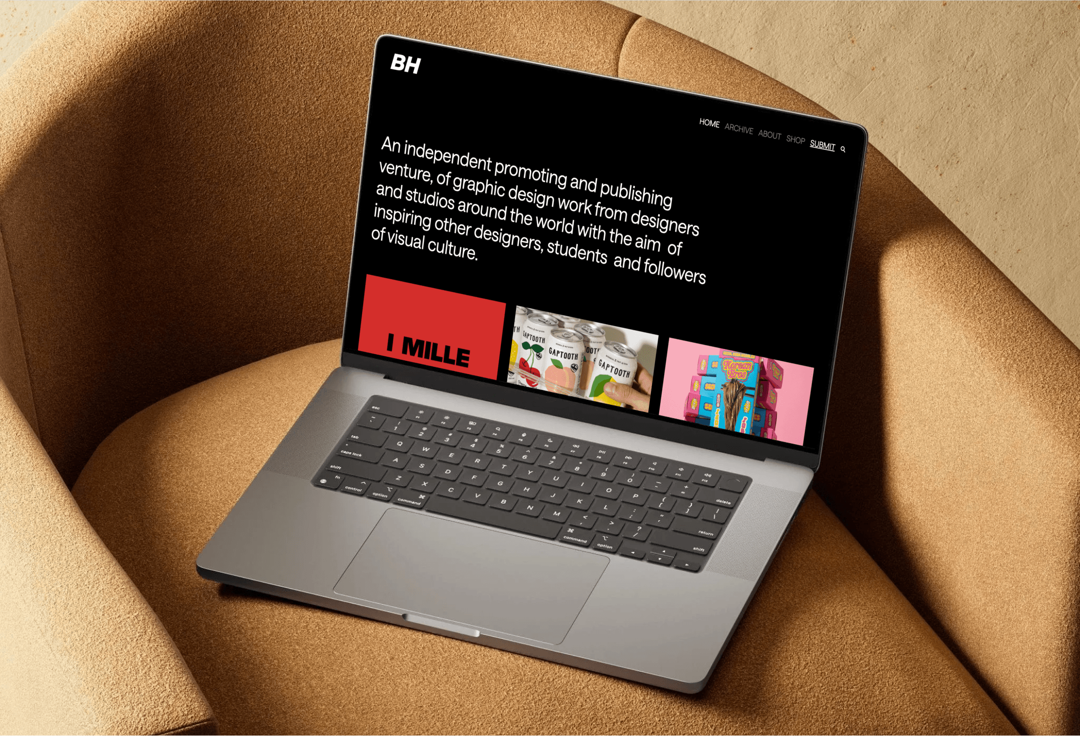
Bounty Hunters is an independent platform that promotes and publishes graphic design work from studios and designers around the world. The content was already there: strong, curated, consistent.
The problem was everything around it: navigation that got in the way, a content structure that made discovery harder than it needed to be, and a visual language that didn't match the quality of what it was showcasing.
The brief was to redesign the site without losing the identity it had built. Same editorial attitude, better everything else. I redesigned the UX from the ground up , restructuring how content is organized and surfaced, and developed the final product on WordPress.
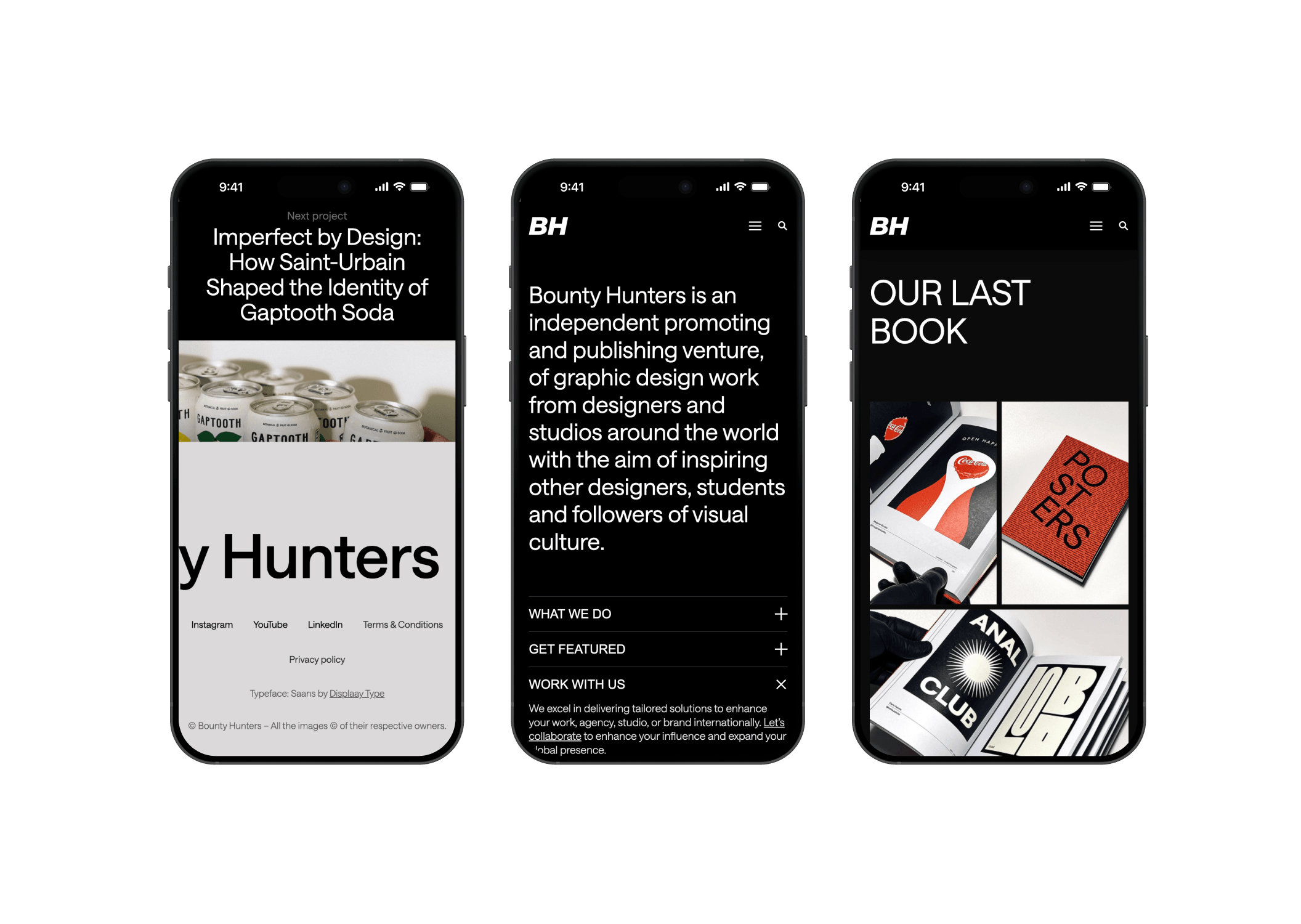
One deliberate change: replacing Helvetica with Saans by Displaay Type. Not just for legibility, but because it felt right for a platform that champions original work: a typeface with character, without the generic neutrality that Helvetica brings to almost everything it touches.
Design Goals
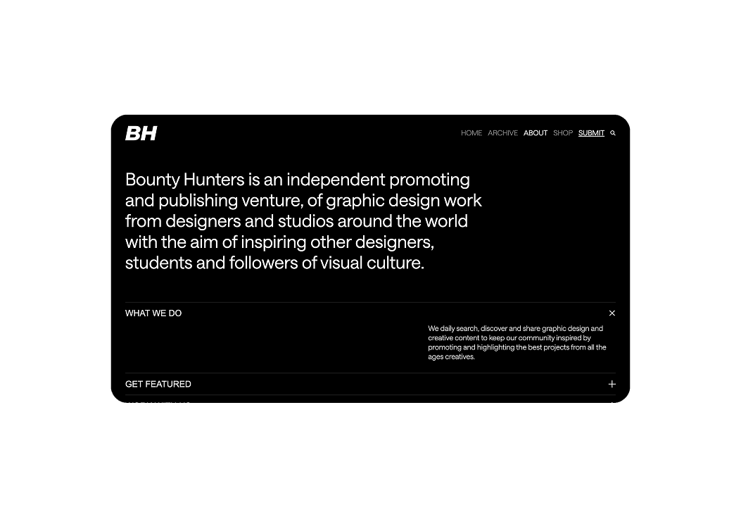
The content was the strength of the platform — the design just needed to get out of its way. The goals were to make navigation intuitive enough to disappear, restructure the content architecture so that good work could actually be found, and build a visual language that felt as considered as the projects it was featuring. Preserving the editorial identity while upgrading everything else.
The Build
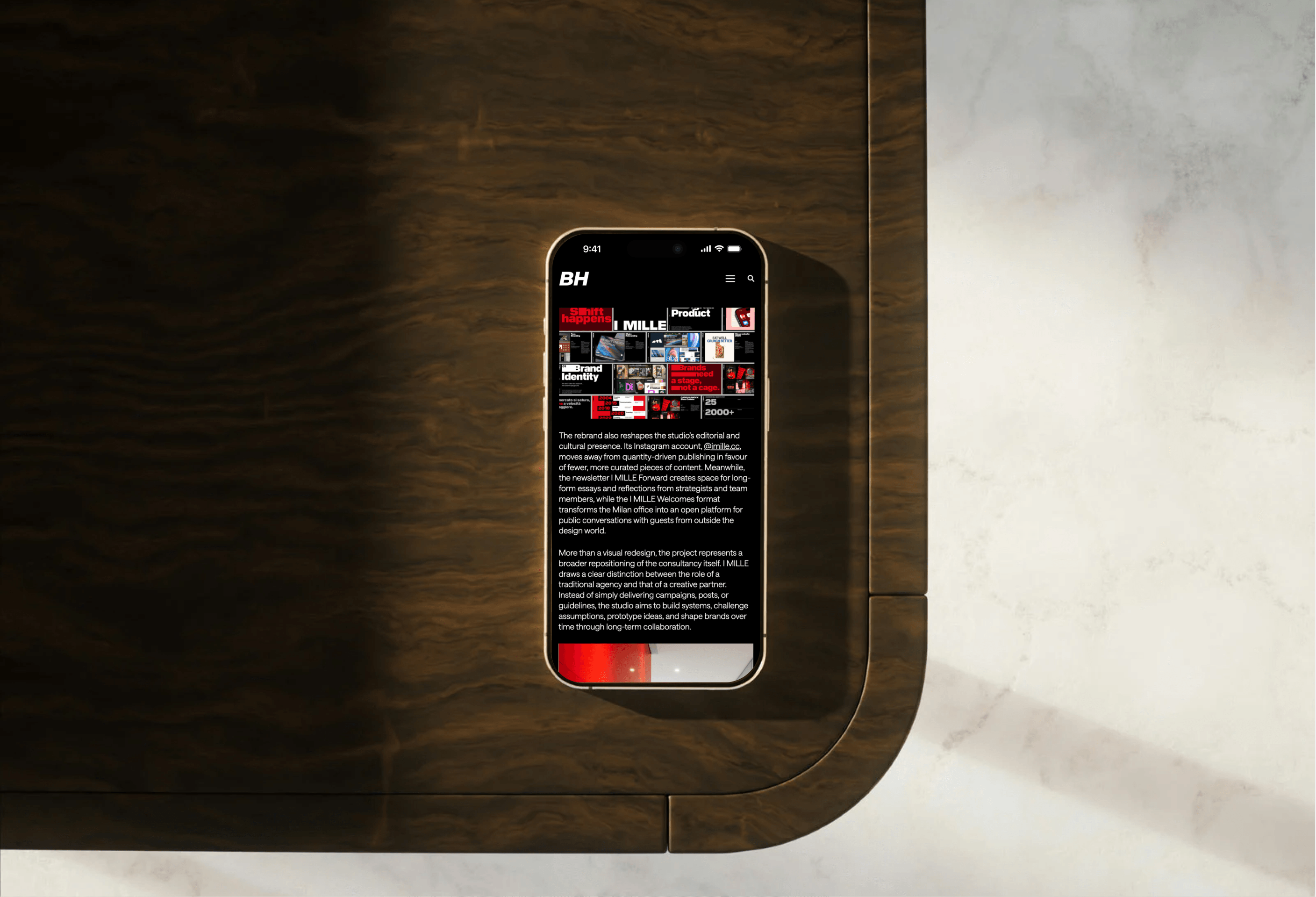
The site runs on a custom WordPress theme built from scratch. The goal was to give the Bounty Hunters team full control over content: publishing, editing, archiving, without depending on a developer for every change. No off-the-shelf template compromises, no plugin bloat: just a theme designed around how they actually work.
Next project
4fett